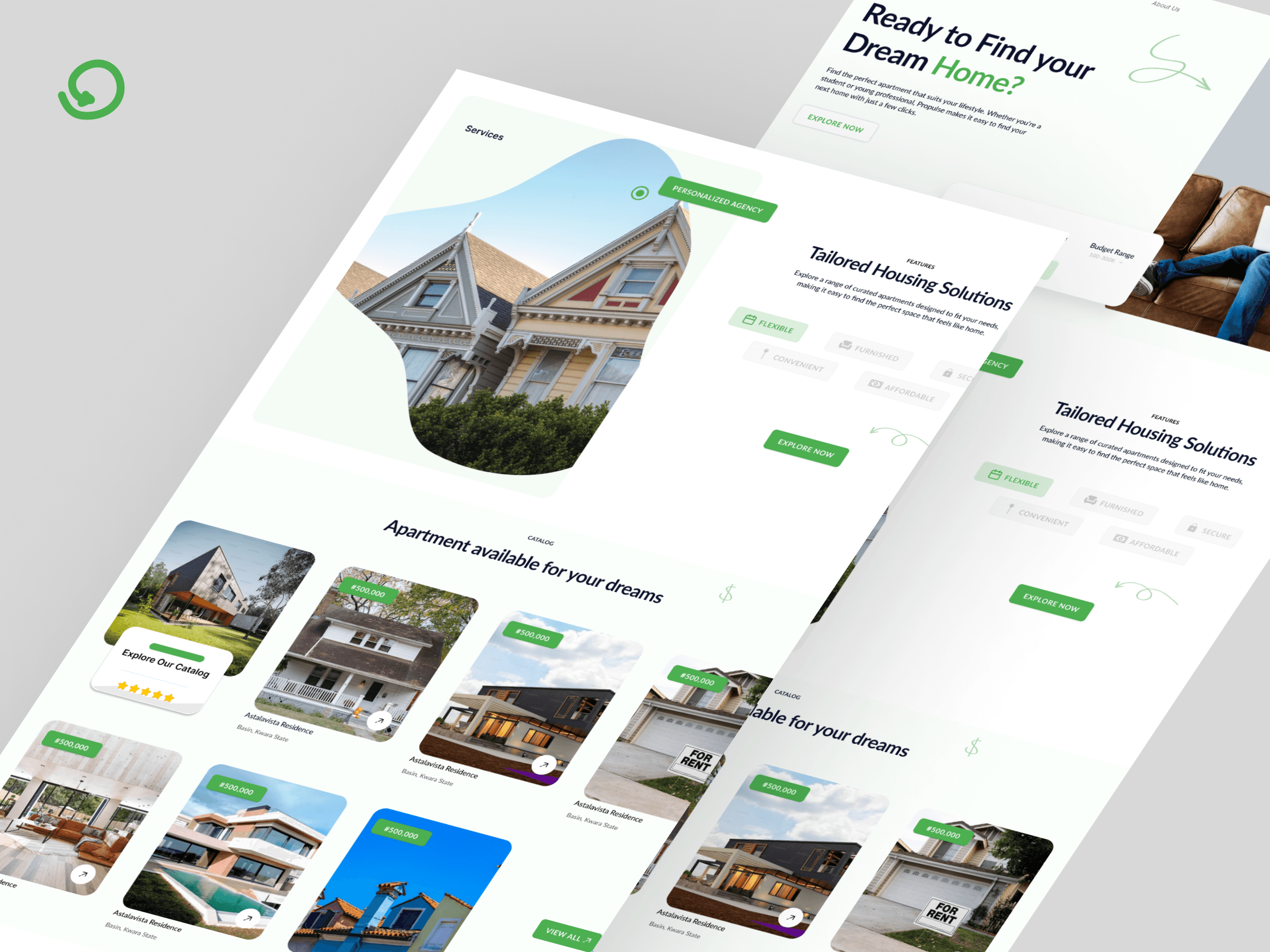
Problem & Research
The earlier design forced users to log in before viewing listings a critical mistake. It lacked trust cues, proper flow, and visual clarity. I kicked off with a quick competitive audit and user flow teardown. Using real estate platforms like Zillow and Private Property NG as reference, I noted what was missing: open access, filters upfront, and trust elements like property status and verified tags.
UX Direction
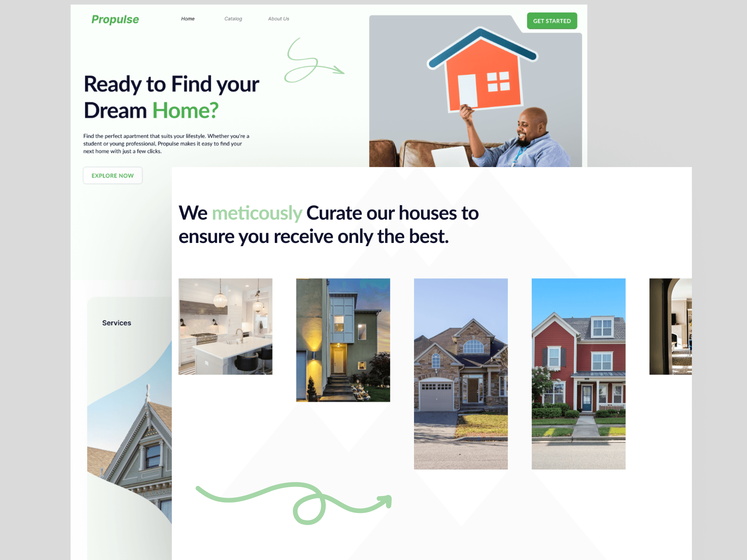
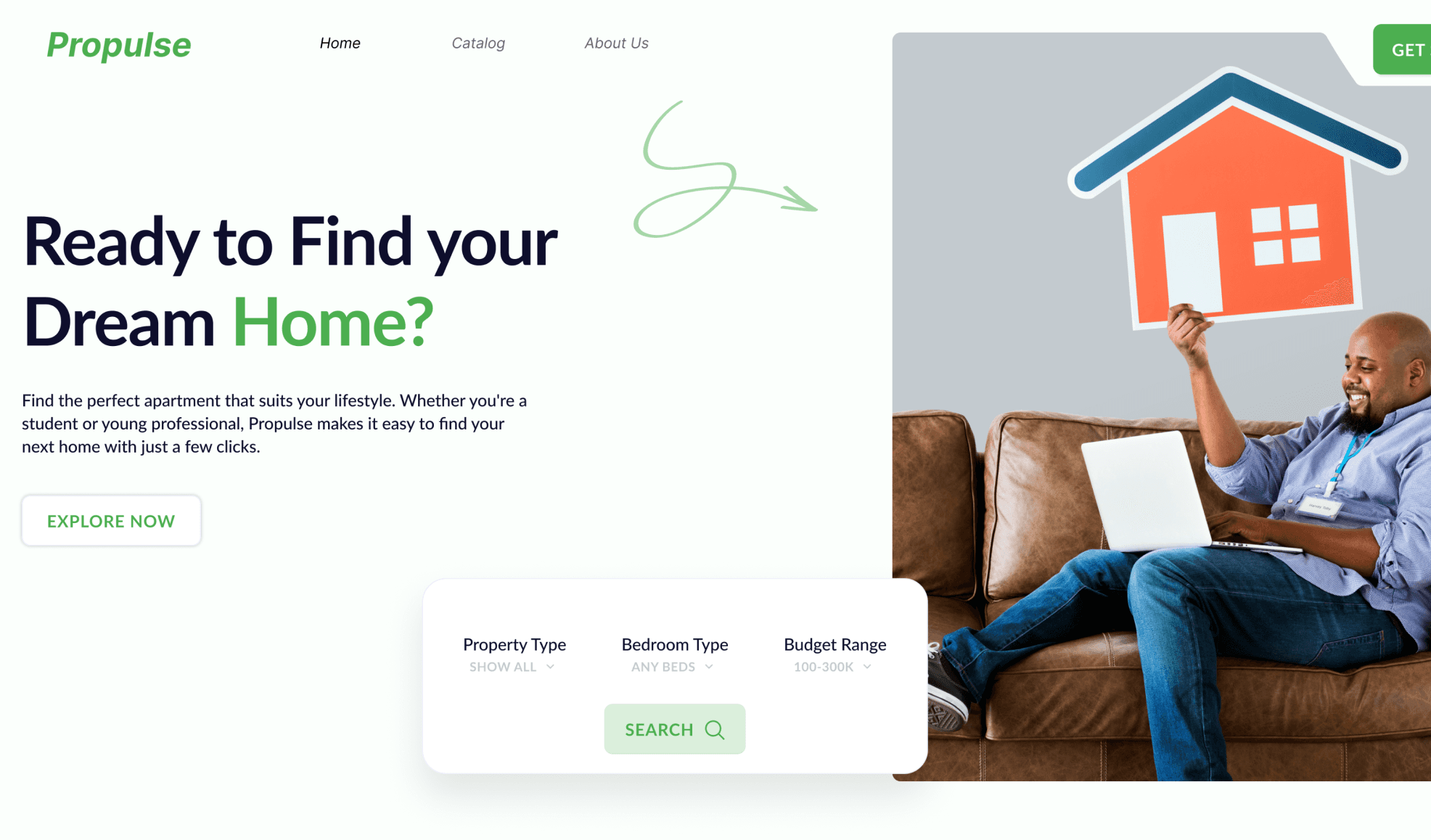
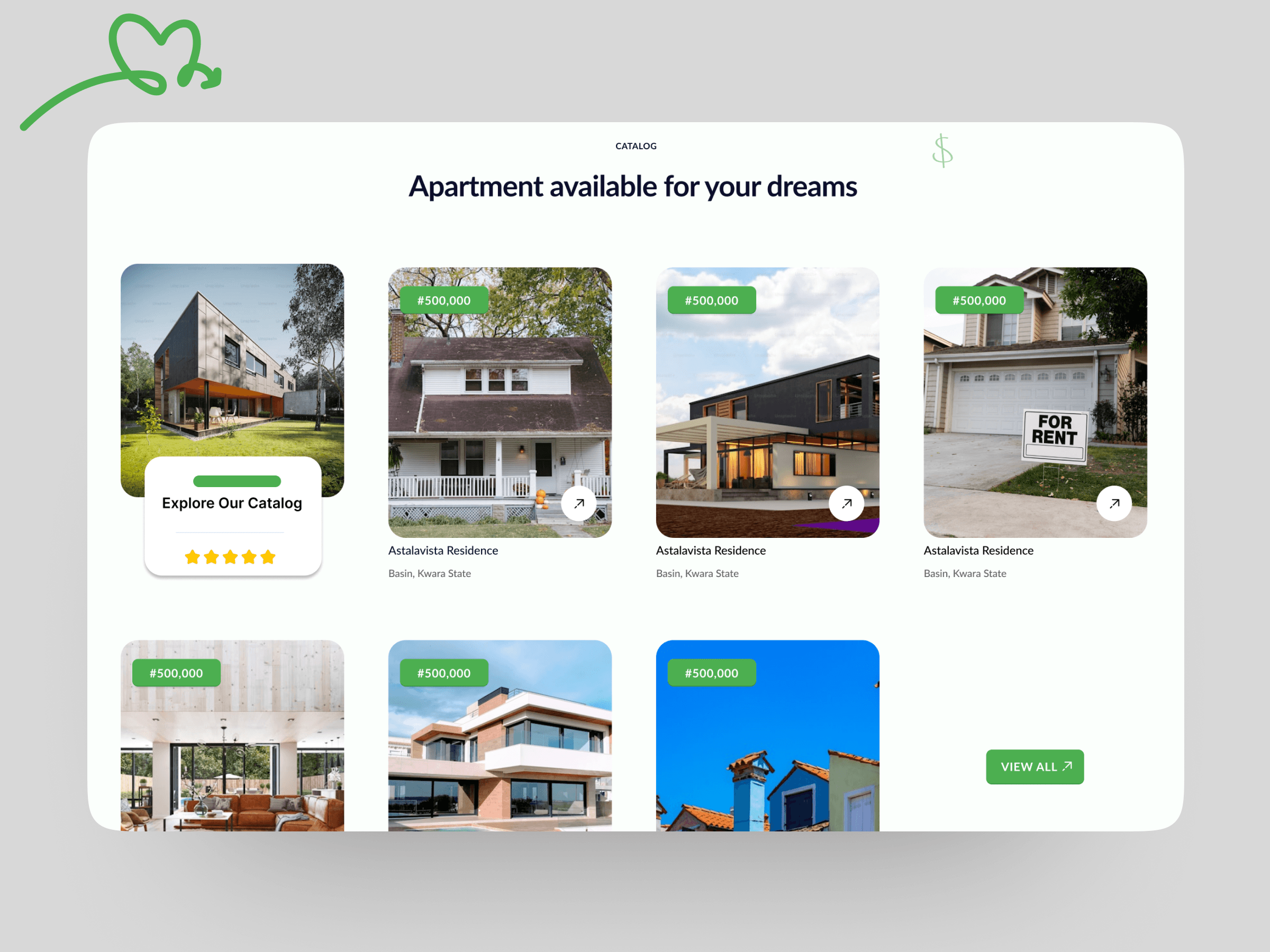
I focused on reducing friction and boosting confidence users can now explore listings first, filter by location or price, and view rich property cards before any signup wall. I also refined the structure with better layout hierarchy, consistent color use, and cleaner navigation.
Ideation to Outcome
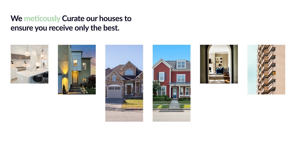
I started with low-fi wireframes to test layout flow, then moved into high-fidelity designs that brought in familiar real estate patterns. I also emphasized property detail pages and visual cues like “for rent/sale” tags and location labels. After sharing with a few testers, I made small tweaks especially on the CTA placements and spacing.
Result
The final design not only looked like a proper real estate platform, it felt like one. Navigation became intuitive, trust was re-established, and the team could move forward confidently with development.