Problem & Research
Web3 onboarding is broken. Most newcomers are hit with complex tools, jargons, and fragmented learning paths. I spoke with early learners, analyzed platforms like LearnWeb3 and Coinbase Learn, and discovered the biggest gaps were poor structure, lack of progress tracking, and overwhelming dashboards.
UX Direction
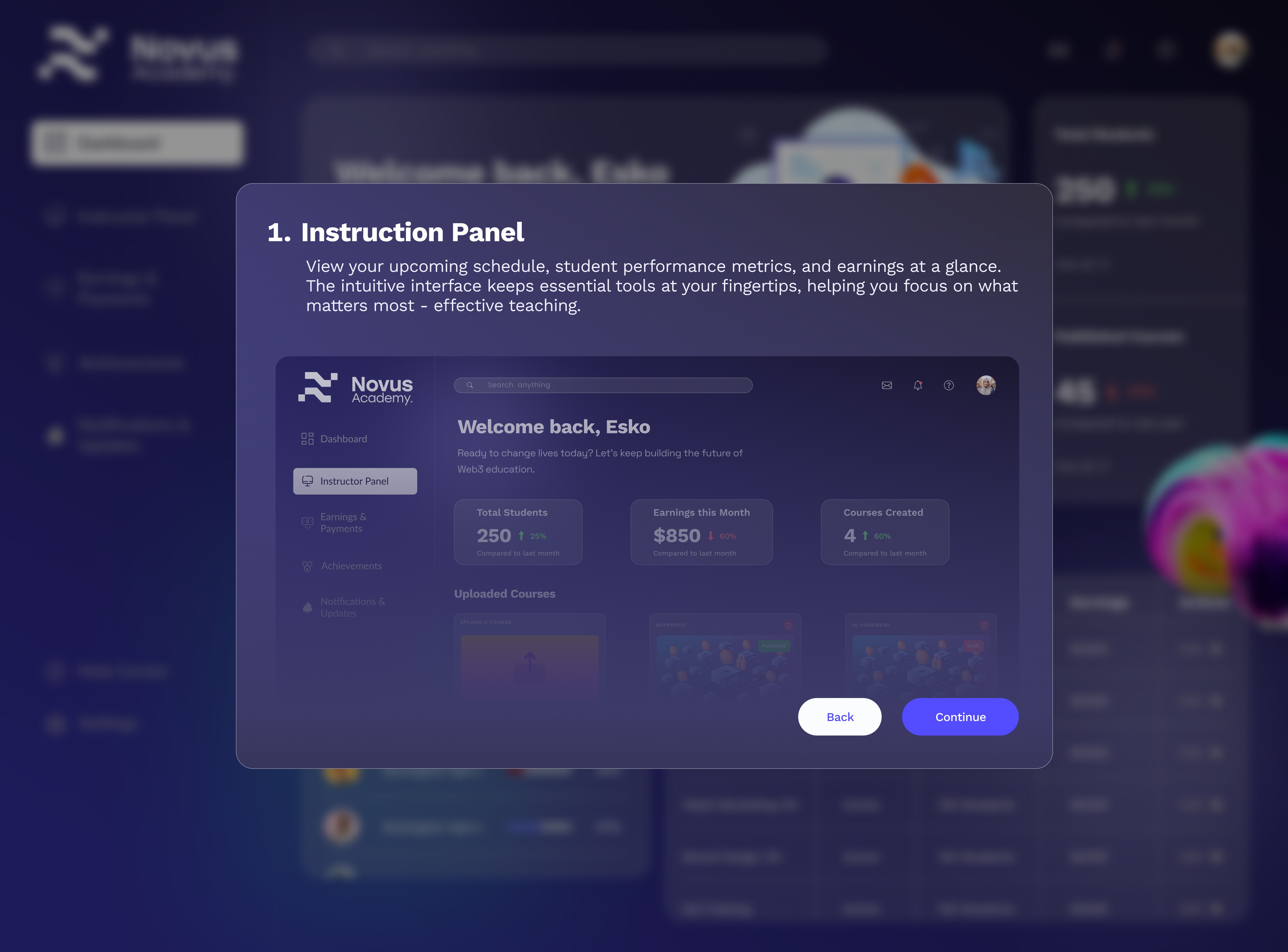
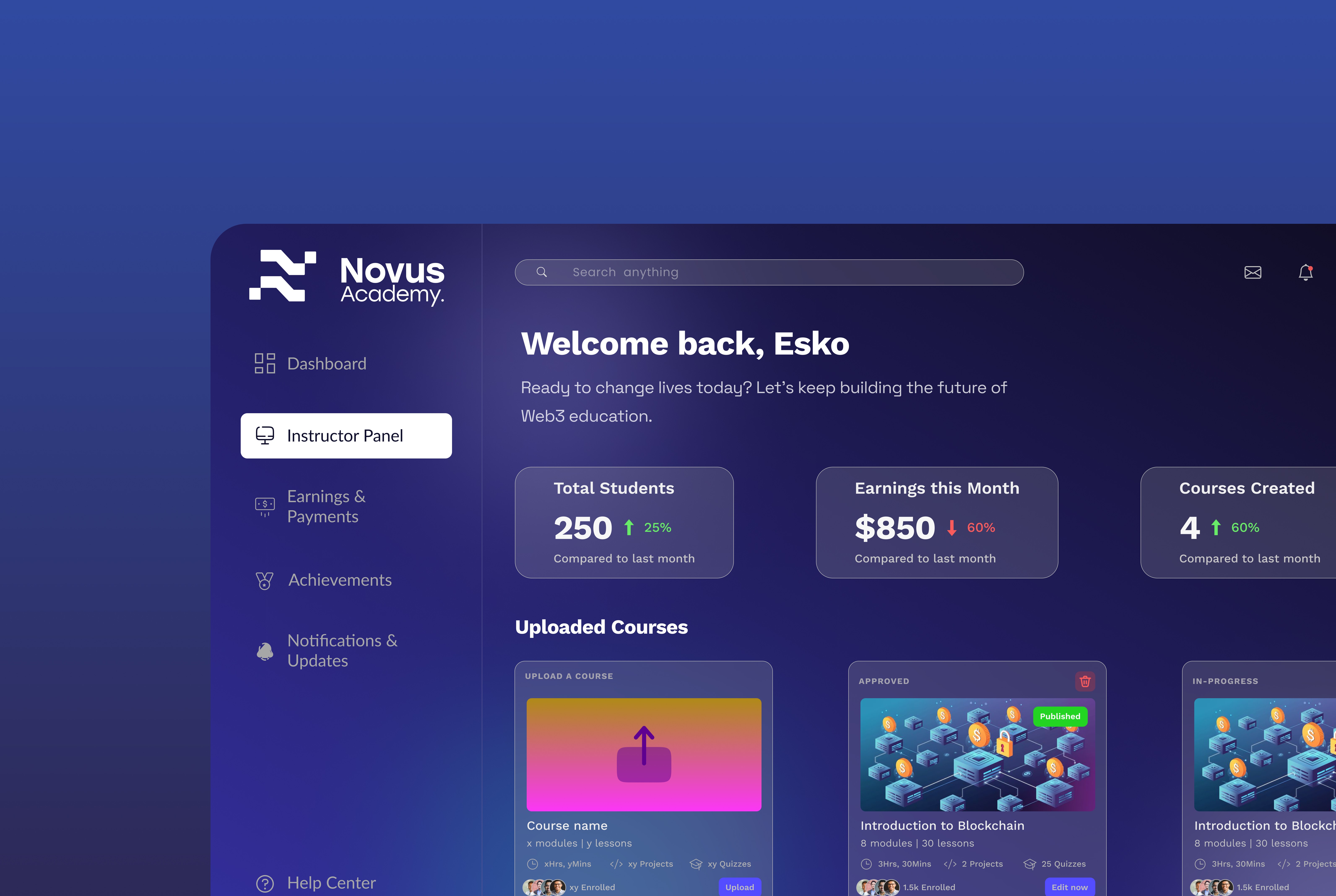
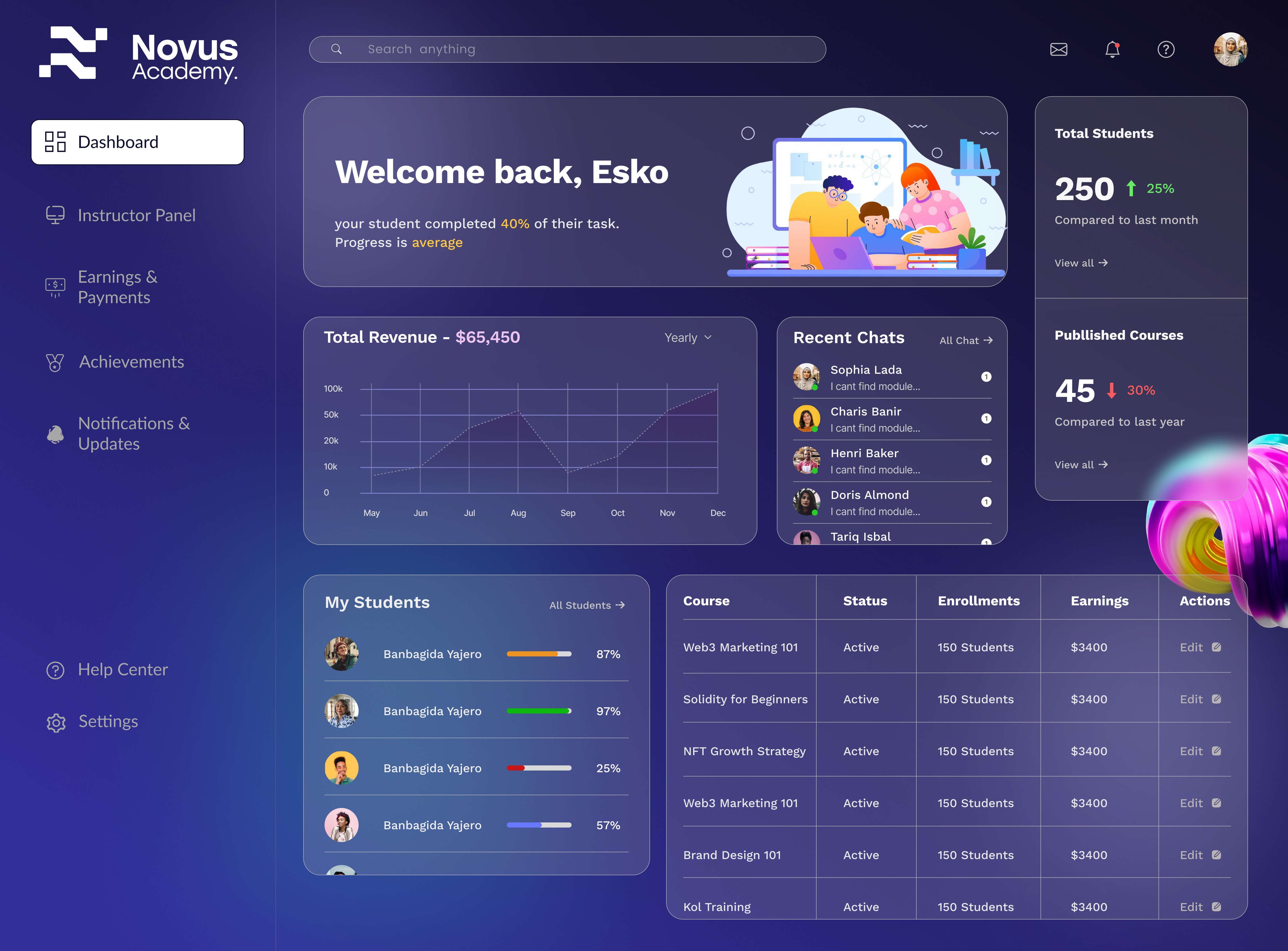
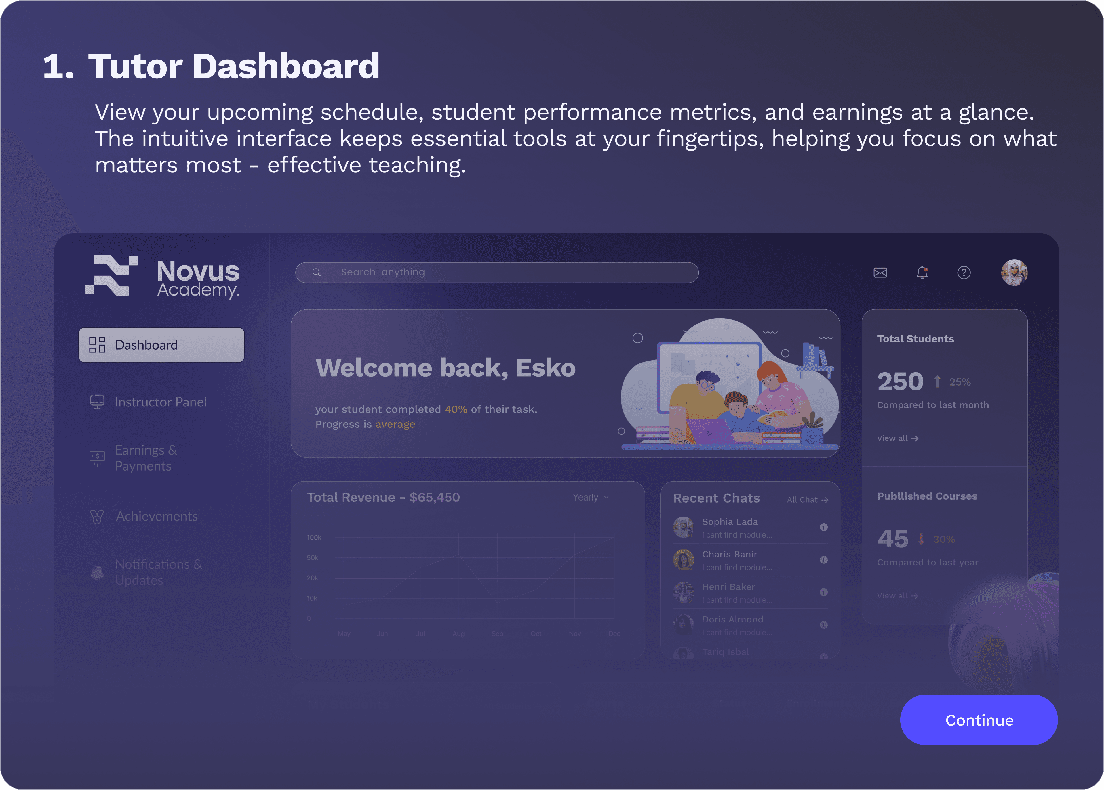
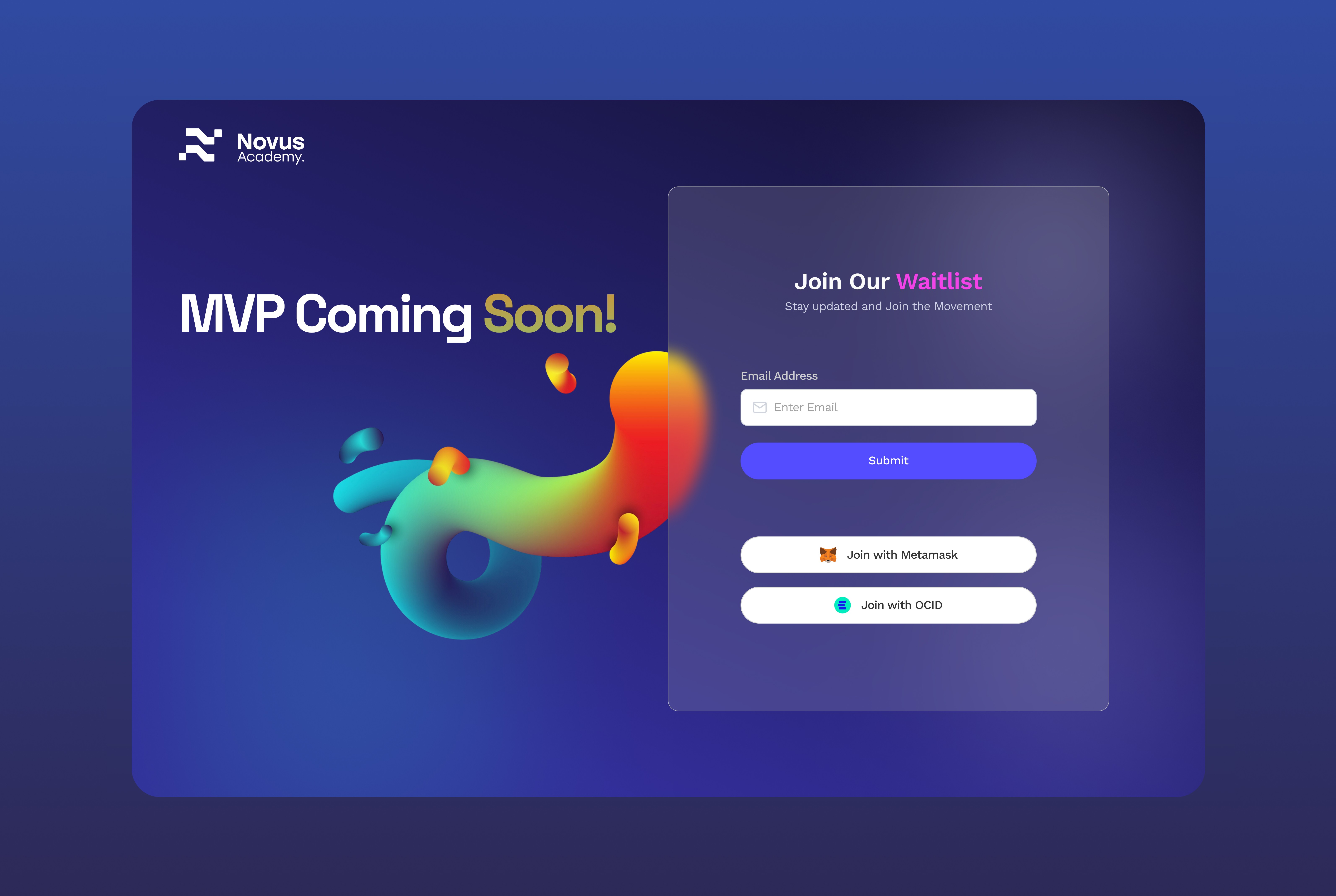
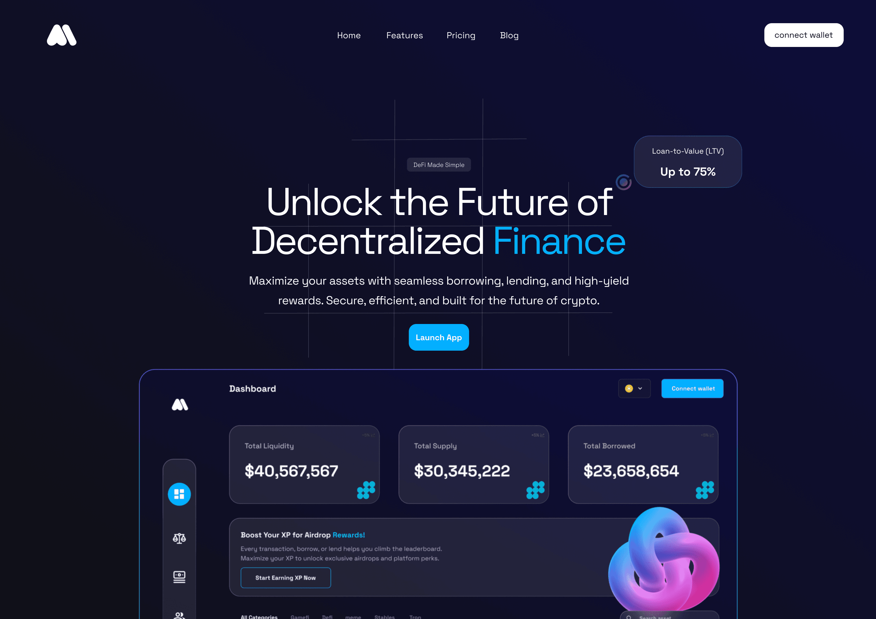
I broke the learning journey into bite-sized paths with clear outcomes: Explore, Learn, Earn. Each module was structured like a progression system, with checkpoints, quiz-style validation, and wallet-based achievement tracking. I designed it for people who want to “get it,” not just read it.
Ideation to Outcome
I wireframed flow-first: how do users move from sign-up to their first on-chain action? Then I layered visual structure that felt less like a blockchain app and more like Duolingo or Notion. I introduced soft colors, progress indicators, and token-based incentives.
Result
The platform now feels like a Web2-grade experience with Web3 logic under the hood. Early users completed courses faster, felt less overwhelmed, and could connect their wallets smoothly. For the Novus team, the design became the foundation for pitching partners and running cohort-based programs.