Problem & Research
Most DeFi platforms feel cold or overly technical. The UI is often cluttered, and there’s a lack of clear visual language that communicates decentralization, security, or modern finance. I studied platforms like Aave, Compound, and Yearn to understand UX gaps especially how too many of them bury actions like “Borrow” and “Supply” behind clunky modals or overwhelming dashboards.
UX Direction
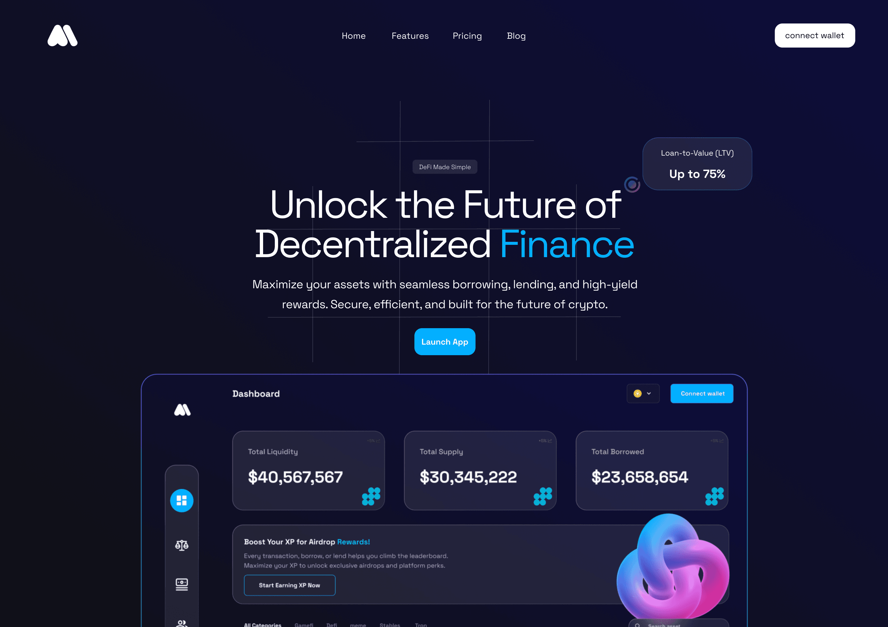
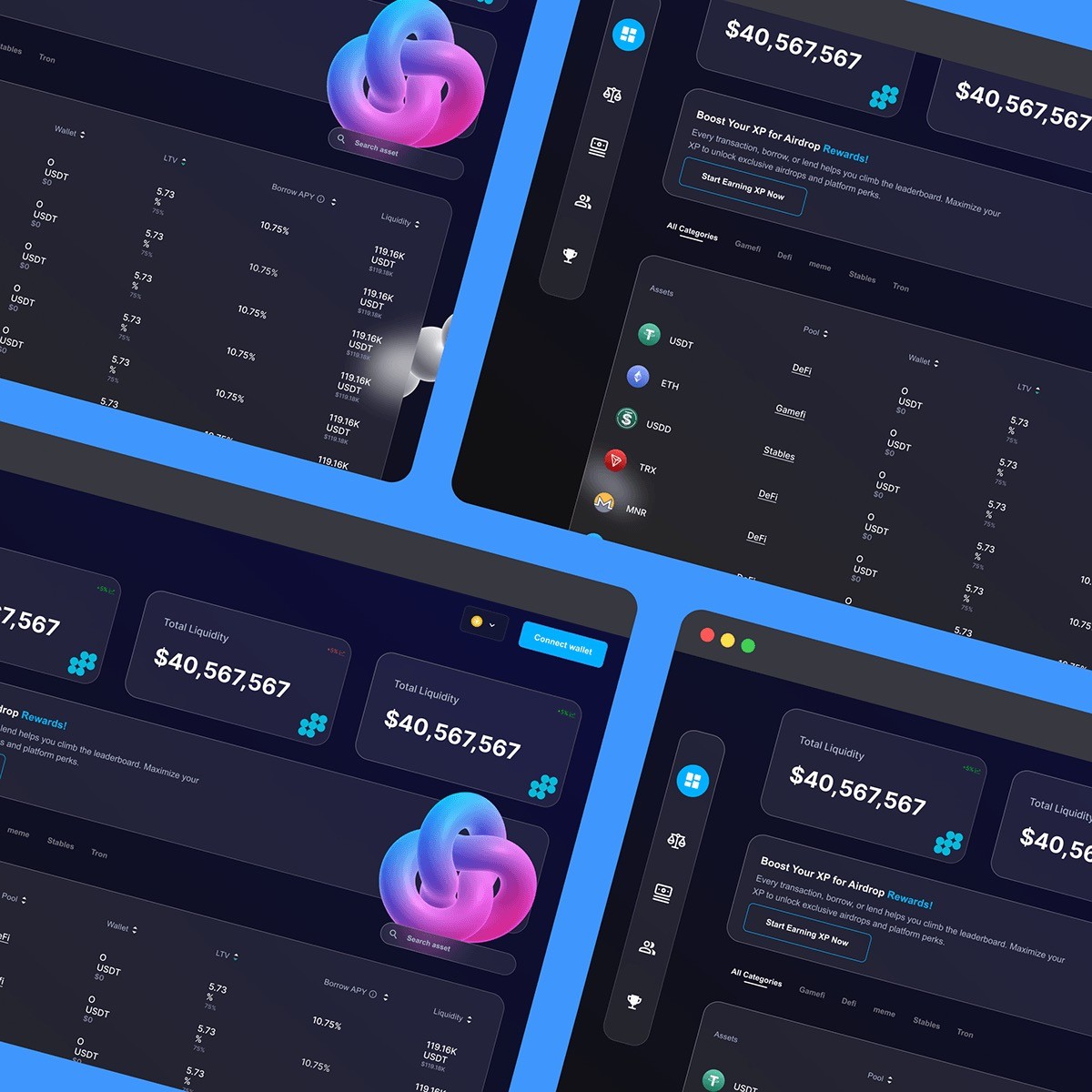
I focused on giving Autonomint a strong Web3 feel: subtle motion, glassmorphism, bold gradients, and a sense of transparency in both interface and flow. I simplified the main user actions—Borrow, Lend, and Connect Wallet so they sit at the core of the layout. The experience is designed to feel light and emp owering rather than intimidating.
Ideation to Outcome
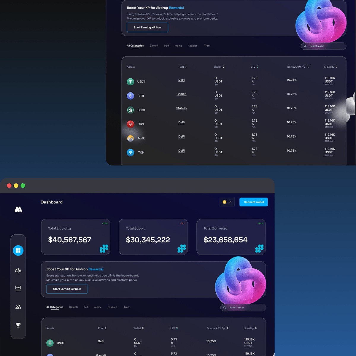
Starting from layout sketches, I designed with clarity in mind structured sections, wide spacing, and visual hierarchy that makes scanning effortless. I also introduced a dashboard with a clean breakdown of supply/borrow activity, and wallet integration cues that look native to the Web3 world.
Result
The case study was well-received by both designers and Web3 founders in my circle. It showed that DeFi platforms don’t have to feel like spreadsheets they can be sharp, secure, and still easy to use. It’s become a go-to reference when I’m asked what modern Web3 UX should look like.