Problem & Research
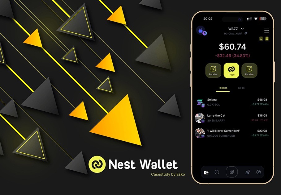
While Nest nailed speed and degen energy, it missed the mark on usability. CTAs were scattered, on-chain actions weren’t intuitive, and key info was buried. I documented every friction point during real usage, then compared it with wallets like Rabby and MetaMask. I found they lacked context for newer degens especially when it came to things like portfolio performance, token risk, and quick exits.
UX Direction
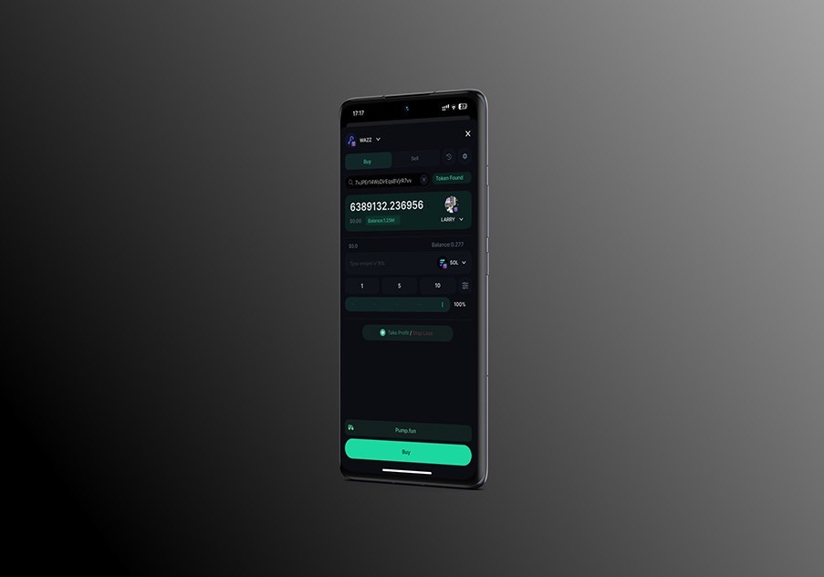
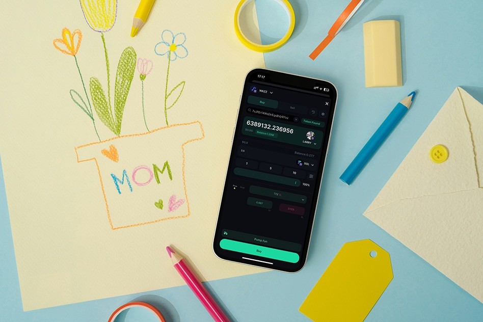
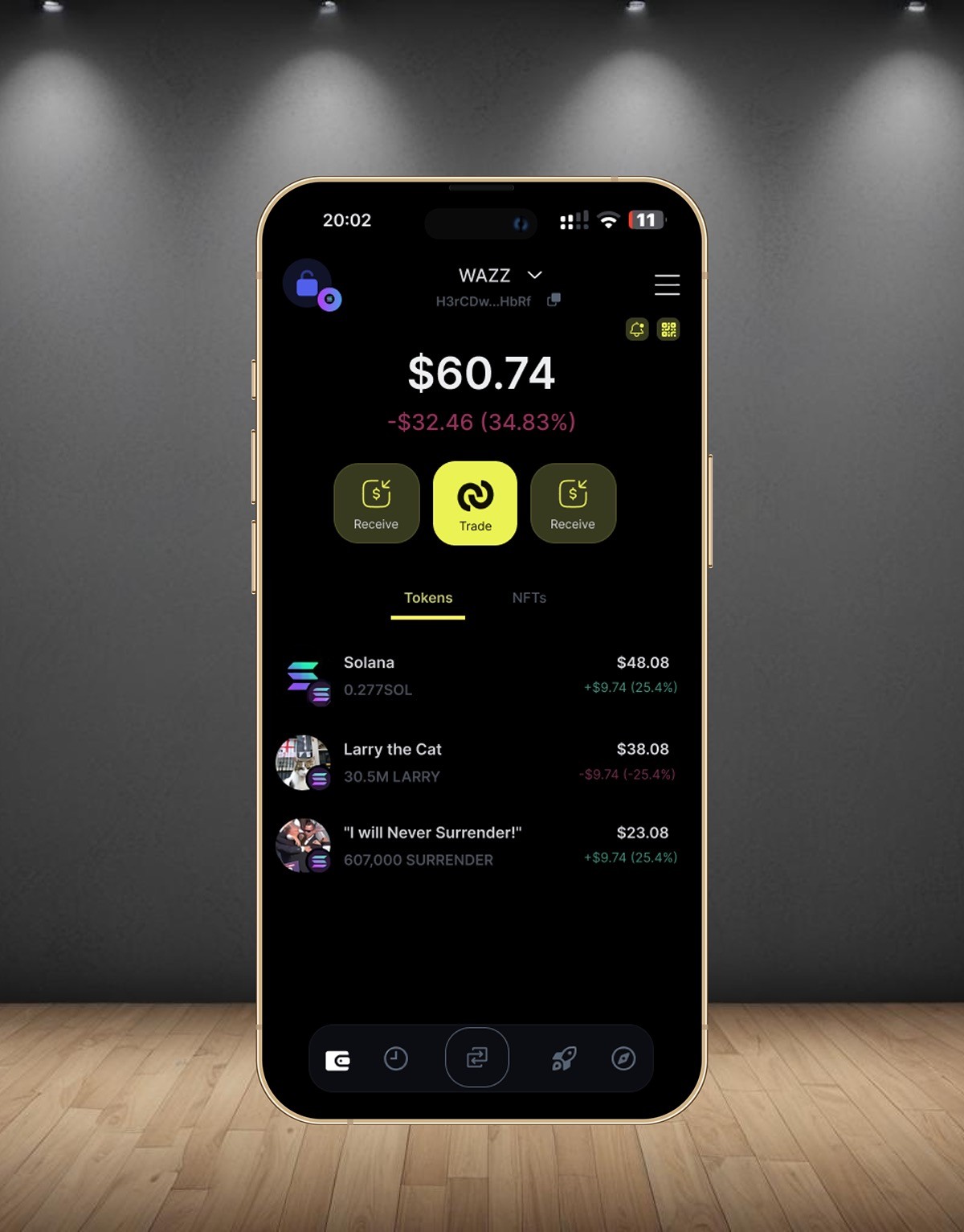
My redesign focused on clarity-first UX without killing the degen vibe. I made the primary actions visible and contextual no more hunting for “swap” or “send.” I proposed new flows like stop-loss by market cap, exit-all positions, and pinned watchlists. All of it wrapped in a UI that still felt fun and fast, but finally made sense to humans.
Ideation to Outcome
Using feedback from real users (mostly DEX traders and NFT flippers), I built screens that prioritize action speed and mental clarity while preserving Nest’s playful tone. Instead of generic wallet layouts, I introduced stackable modules and sticky utility bars for key actions. I also mocked up a “Panic Mode” feature for dumping volatile assets in one tap.
Result
The best part? Nest's team saw the case study and later implemented several UX changes including CTA placement improvements and improved wallet summaries. That confirmed what I believed: when degens feel understood, they stick around and good UX makes that possible.